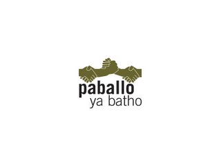
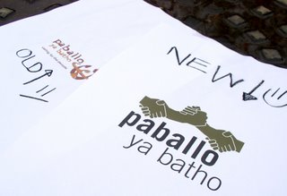
New Paballo Logo :)
Paballo is all about people. It’s about the connection between people. It’s concerned with developing relationships and nurturing friendships. It aims to care for people and validate them. The new Paballo logo takes its motivation and form from this personal and people-orientated philosophy.
The logo is based on a greeting. When we first meet people we introduce ourselves, usually with a handshake. This is an important moment of contact between two people. From then on, the handshake becomes part of our greeting of the people we know. The handshake in the Paballo logo captures the 3 movements of the African handshake, and expresses Paballo’s pride in being African. The colour of the hand is not race-specific. This shows that the focus is on people and not skin colour.
The three hands are interlinked, which demonstrates the unity and interdependence of the various people involved with the Paballo outreach. The word Paballo is in bold to place emphasis on the care element of the project. The copy is written in lower case in keeping with the personal and friendly tone; there are no pretensions here. The handshake holds within it the promise of meaningful relationships with the new people we meet.
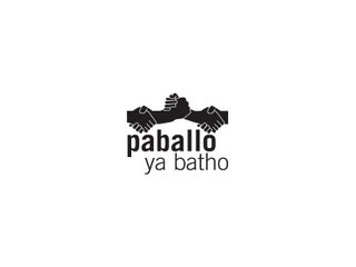
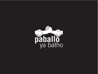


posted by :D at 9:35 AM
![]()

2 Comments:
wow. congratulations your logo is stunning! May you continue to touch many lives with this new identity!
I really like your new logo, lovely stuff, great work. and good luck in everything you embark on.
Post a Comment
<< Home